Introducing bespoke font Plato Sans
It demonstrates the seriousness of a newly founded design agency to shape their own branding with a bespoke typeface. Design agency Plato is setting out to use technology and a distributed creative network to make quality design services accessible to companies regardless of their size. To verbalise this dedication to quality in their design projects, their own brand needed to reflect this level to dedication and attention to detail. In late 2018 Underscore and Plato’s in-house designers joined forces* to refine their existing logotype iteration. From this collaboration we expanded the logotype into a full headline typeface in order to equip this new design brand with a unique typographic voice all of its own.
Typography is perhaps the most sublime forms of visual communication. While any text present in graphic design will always cast a mood, the actual design of letter shapes rarely stems into the center of attention. Plato’s mission is to help their clients increase their company value through design. To prove this commitment, Plato’s own brand had to exert design know-how while also showing elegance and restraint: Clean lines, a black and white aesthetic, and plenty of room for the client work to shine. From a type designer’s point of view, being involved in any branding project at the point of inception is exciting. It opens the doors for a wider involvement with the brand’s purpose and voice. Finding a typographic tone that matches a stated brand vision is equally much about defining that vision and giving it a visual expression. In other words, it is bound to be a moving target, because the type direction is part of the brand itself. Instead of settling on using an existing typeface and its mood, potentially used by other companies, is always a compromise in terms of unique expression. As part of Plato’s identity this collaboration meant creating a very own typeface for Plato’s logotype and subsequently expand it for use in headlines. The aesthetic advantages of undertaking any bespoke typeface design project are self-evident: A custom font design is tailored to your brand in mood and expression, it is exclusive to your company’s use and promotes recognizability, and finally it comes with no cumbersome license management overhead required with common retail fonts.
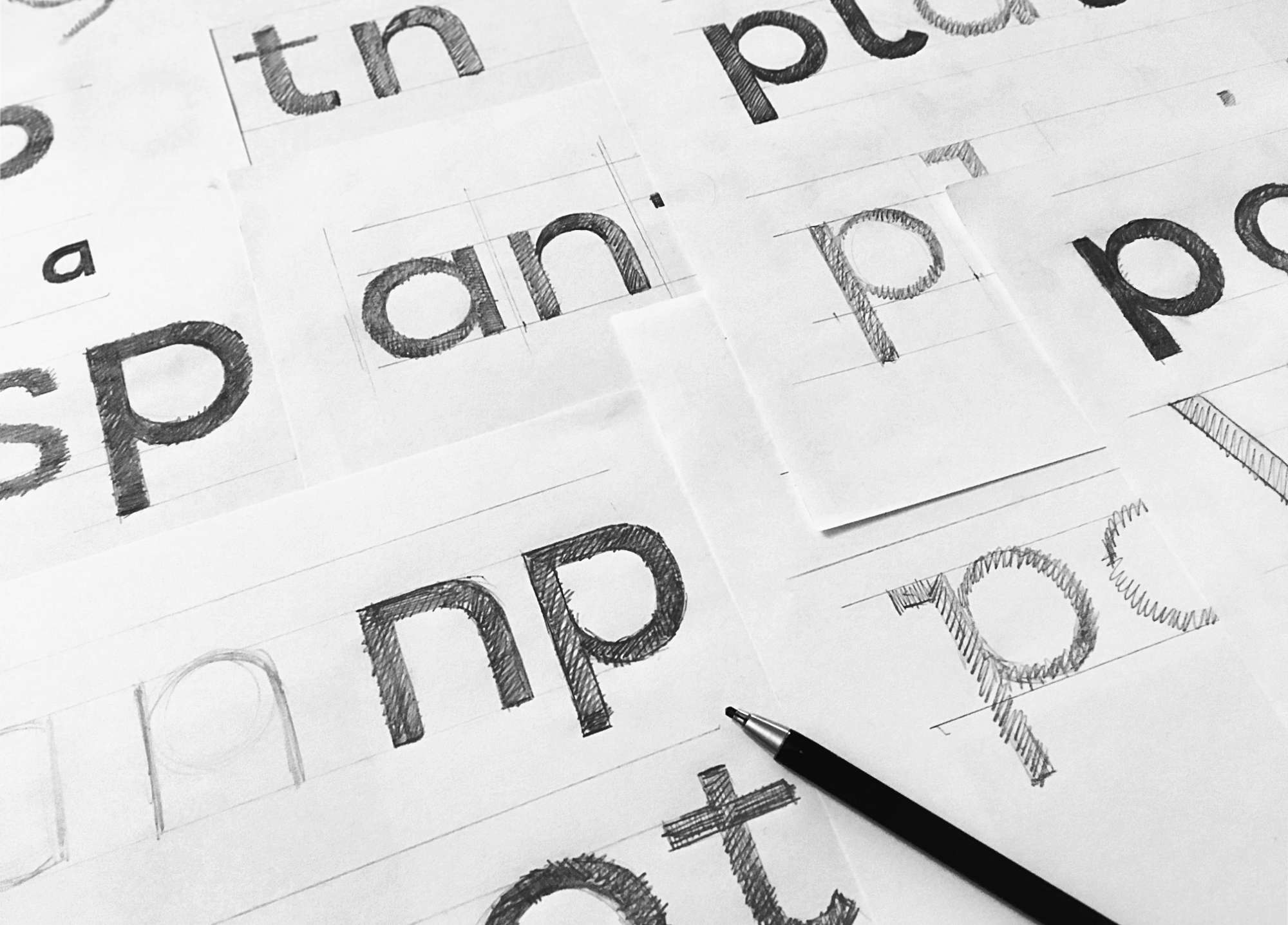
To kick the project off we engaged in several iterative design rounds focused on highlighting different components of Plato’s way of working and translating them into typographic aesthetics. More than defining what visually looks right, the challenge lies in creating a common language to accurately describe the goal, and talk about proposals in a meaningful way. The early stages of type design can be interpreted as a sort of facilitation of design. Especially in type design and typography, interpretations of attributes such as “timeless”, “modern” or “legible” can mean any number of things and require further context. With quick paper sketches we contrasted different interpretations against one another. How eccentric should the type design be in order to communicate Plato’s mission as design leader? Is the modular nature of Plato’s service offering the main attribute that should be highlighted in the brand? How friendly is friendly? The list goes on…
From the get-go a geometric aesthetic was identified as placing Plato, visually speaking, in the field of contemporary design. Purposely breaking with expectations in current typographic design was one avenue discussed. However, the insight most in favour of an underlying geometric starting point was a sense of belonging to, not breaking out of, contemporary design. For Plato to be convincing as a new design agency, clients would need to easily identify the logotype as being part of design in a larger sense.
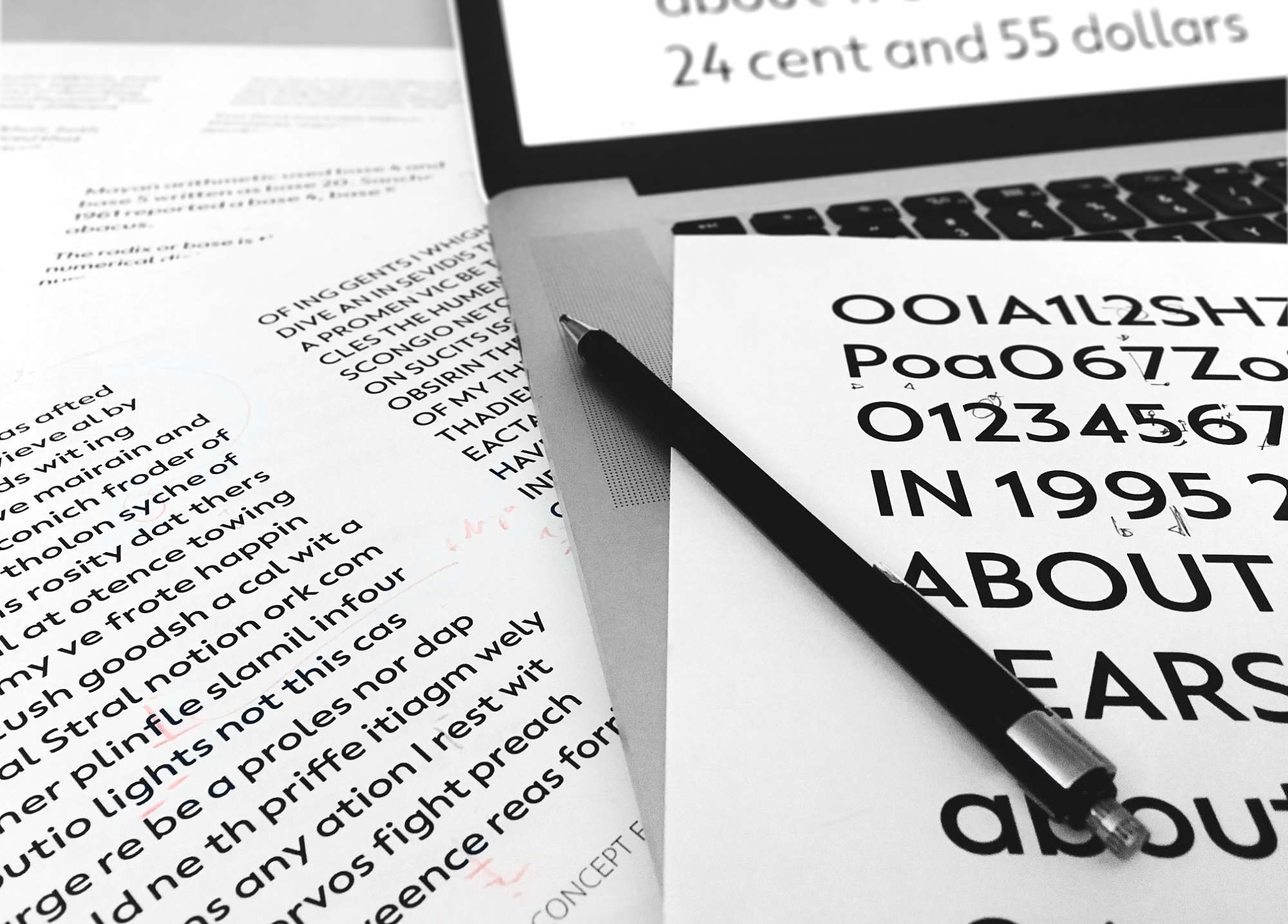
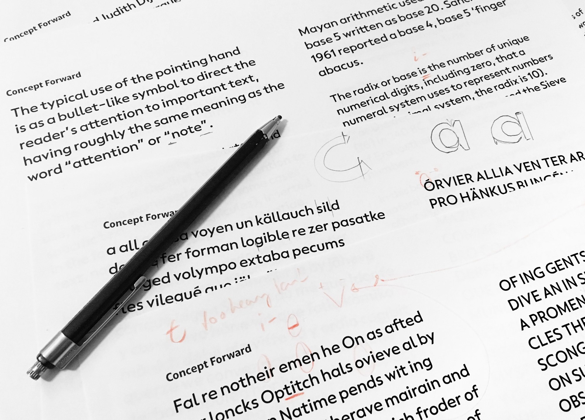
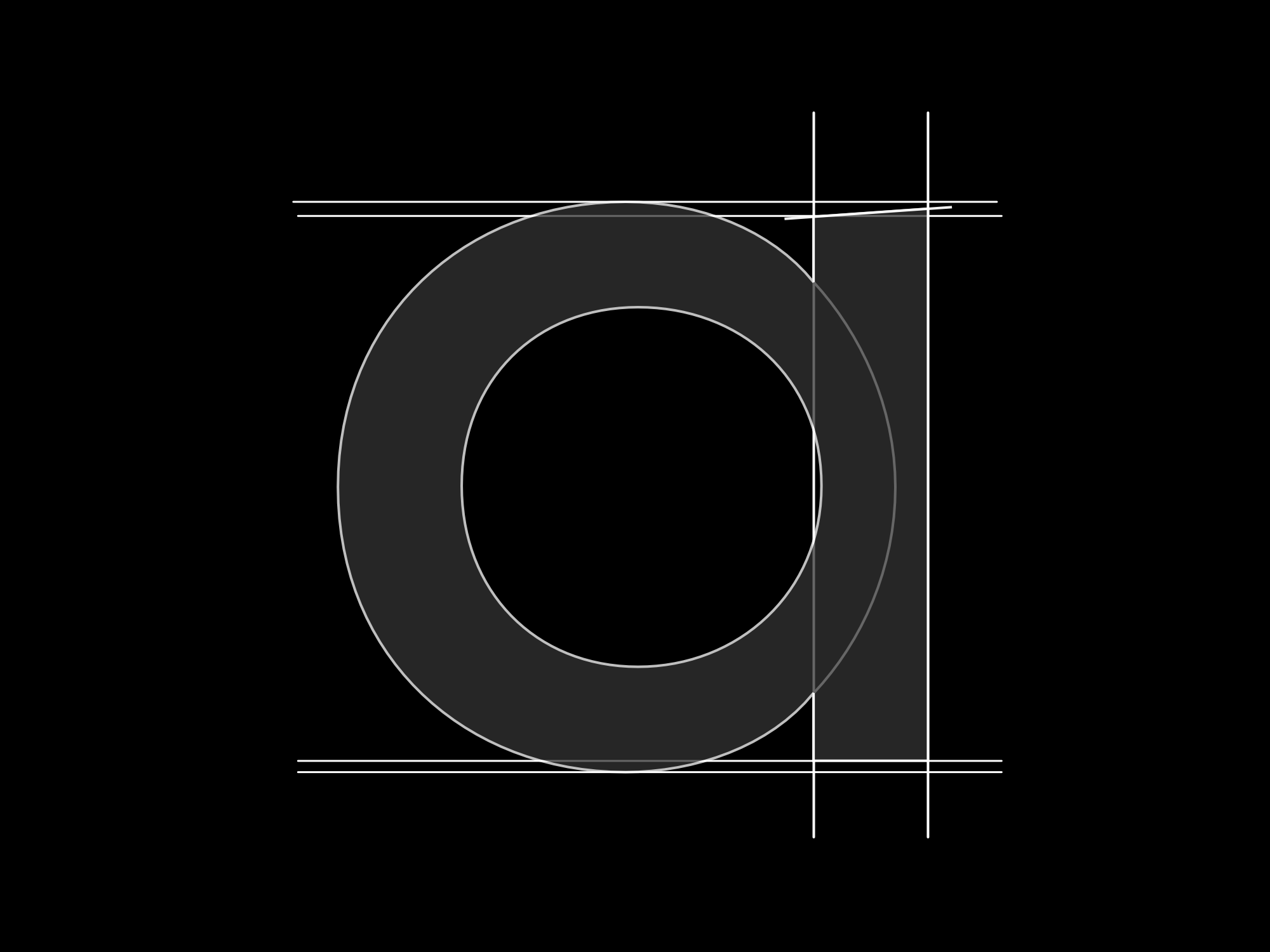
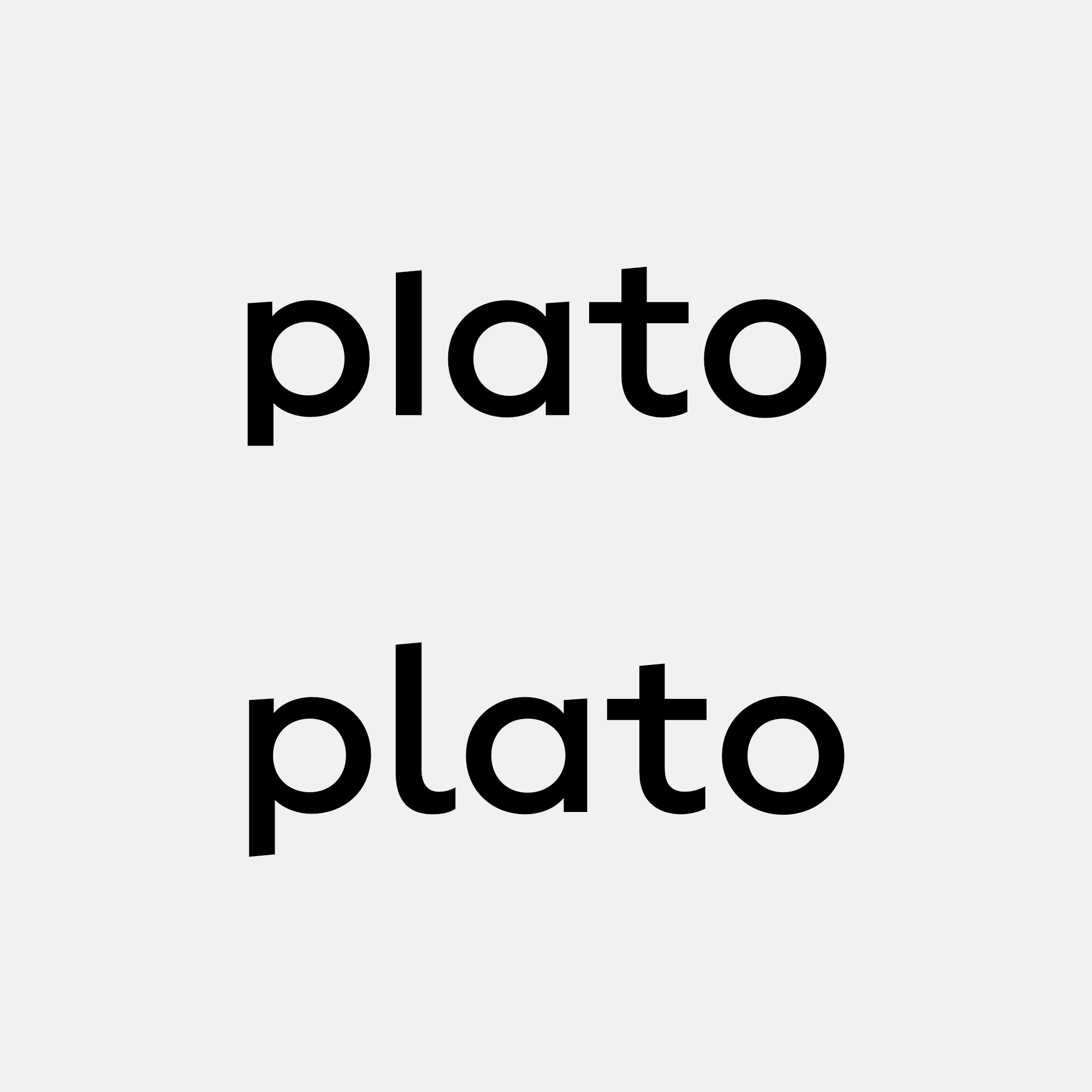
The subtle tones of type design are often concealed in minute details. In the case of Plato Sans one of the traits the team focused on early was combining the round and friendly tone of geometric shapes with a certain sharpness. In brand tone, this corresponds to a frank directness and the know-how of Plato’s designers. Cutting terminals at straight vertical angles breaks the dominance of round shapes in the lowercase. But more than that, details like that also show consideration for the eventual use of the font. While stylistically plausible, a terminal at perpendicular angle will always result in anti-aliasing at that angle, whereas the straight cut will render sharply in Plato’s main communication channels on screen displays. Equally much a detail, many of the stem terminals on the x-height are cut at a slight upwards angle. Compared to the relative rigidness of perfectly level stem terminals this adds a subtle lifting forward momentum to text, and lends the appearance a dynamic and airy vibe. More than the lowercase, the capitals of Plato Sans are a stylistic hybrid of mixed origin. Not entirely bound by the strict geometric construction of round and sharp diagonals, some of the capitals balance grotesque and humanist influences to the effect of an overall more even and less eccentric appearance in all caps typesetting.
While the team and I were wary of the connotations of a geometric sans serif basis as a typographic choice that is currently in vogue, it was paramount to not just “hack away” bits and pieces. It was paramount to us to make aesthetic choices that were both embracing type design craft practise but also rooted in a deeper understanding of the brand and its translation to visual aesthetic were. A big part of attention to quality is also invisible. An extensive charset supporting the majority of languages using the Latin alphabet, the meticulous spacing and kerning in the font to neat little features like the Opentype substitution to write Plato’s logotype in the font (it uses shorter ascenders and descenders) are part of the leg work that went into this bespoke typeface.
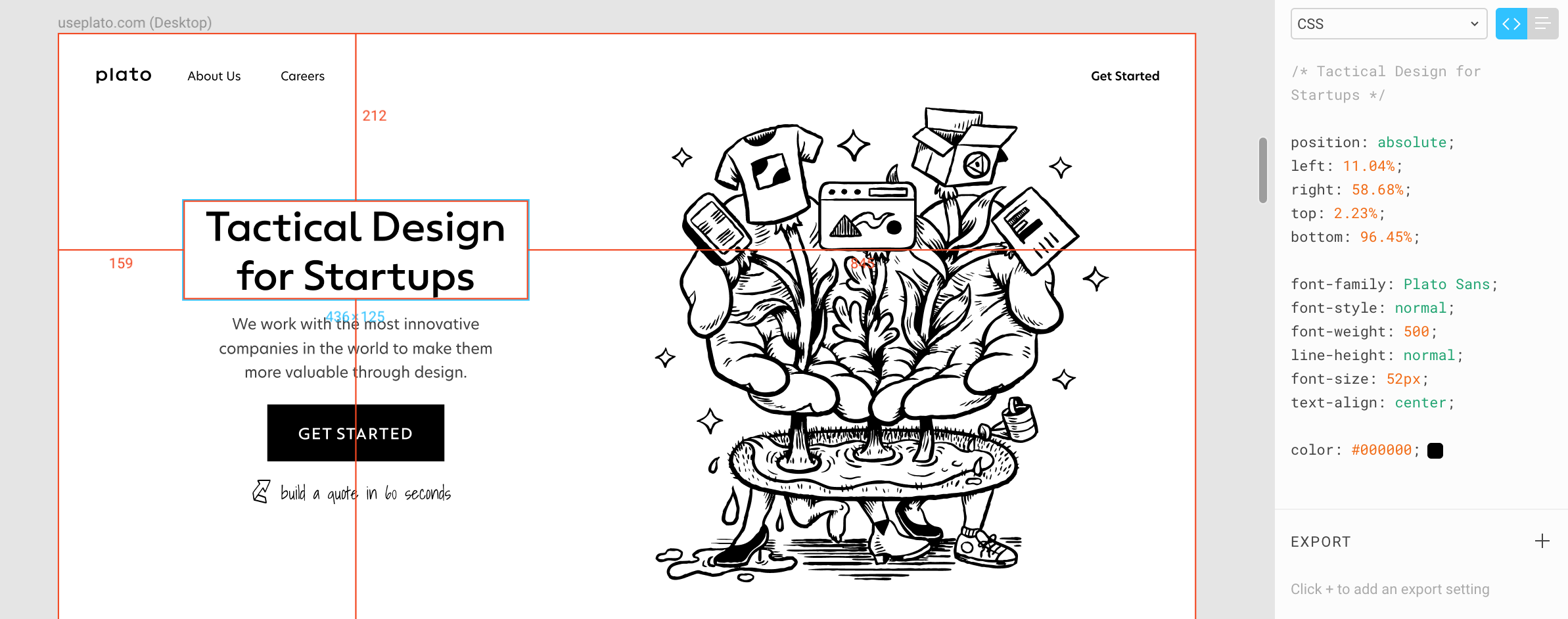
Another great benefit of this collaboration is the early stage type design was brought in to the other design activities relating to Plato’s launch in December 2018. Early on the team was able to preview and test different font variations in actual interface elements and logotype applications. Particularly defining the exact weight and optical size for the font was something we undertook with a keen eye on the end-use, always proofing in actual layouts with real context. At the same time this allowed us to achieve an overall refined typographic palette that we augmented with Opentype features, alternates and some custom icons embedded right in the font.
With this strong typographic debut Plato solidified their claim to excellent design right from outset of their own brand. From a collaborator’s point of view it speaks volumes about the lengths this distributed design firm will go to match a particular design need with the qualified specialists in its creative network, myself included. This is something past and future clients of Plato certainly can attest to, and will give not only Plato, but most importantly their clients, an competitive advantage.
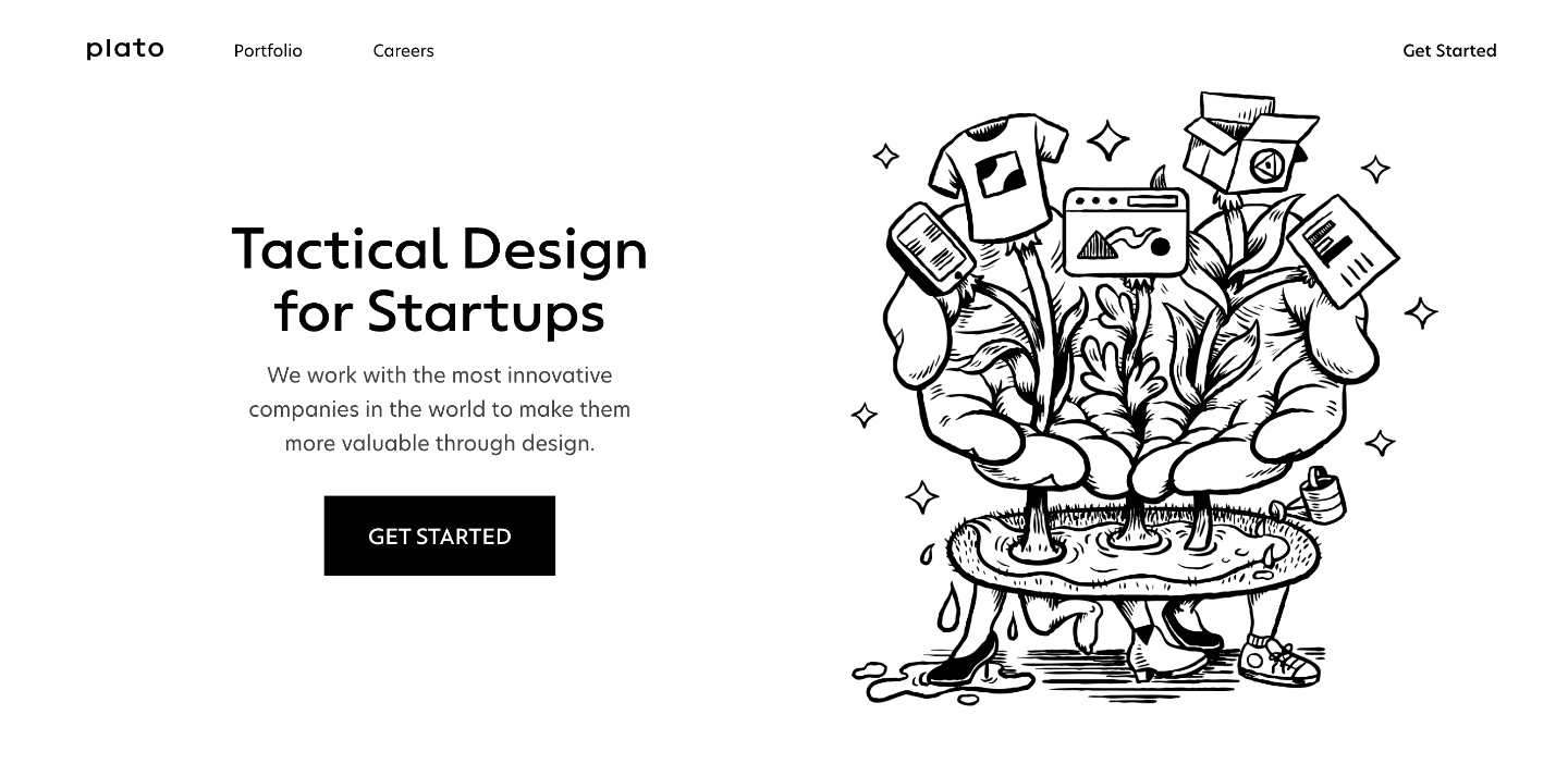
Finally, feel free to go check out this fresh new design agency and their superb portfolio:
Visit useplato.com
