Introducing the Jozef typeface family
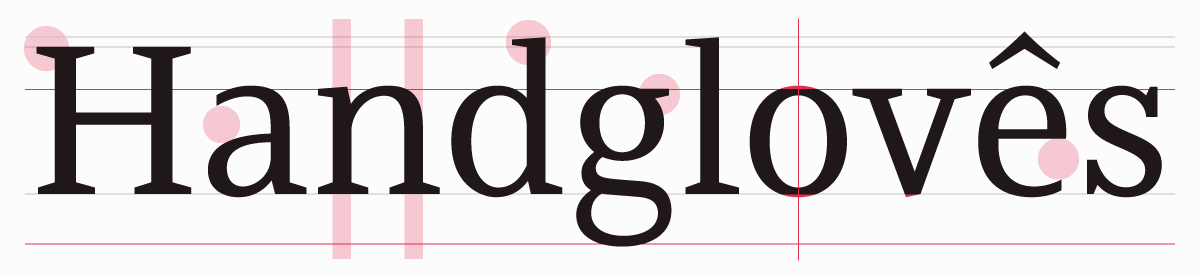
Jozef is a serif typeface with modern character and a firm voice. Its strong serifs and vertical stress set a strong rhythm in larger sizes, and give it composure in smaller sizes. On screens those details render consistently when set in body sizes, giving the text a regular and even structure. The vertical stress of its round shapes is somber and factual, with open apertures to support excellent legibility also in small sizes.
In the vertical dimension the typeface has a generous x-Height while equally providing ample room for accented characters of the many latin based language supported. Horizontally it runs narrow without looking condensed, making it an ideal candidate for paragraph text.
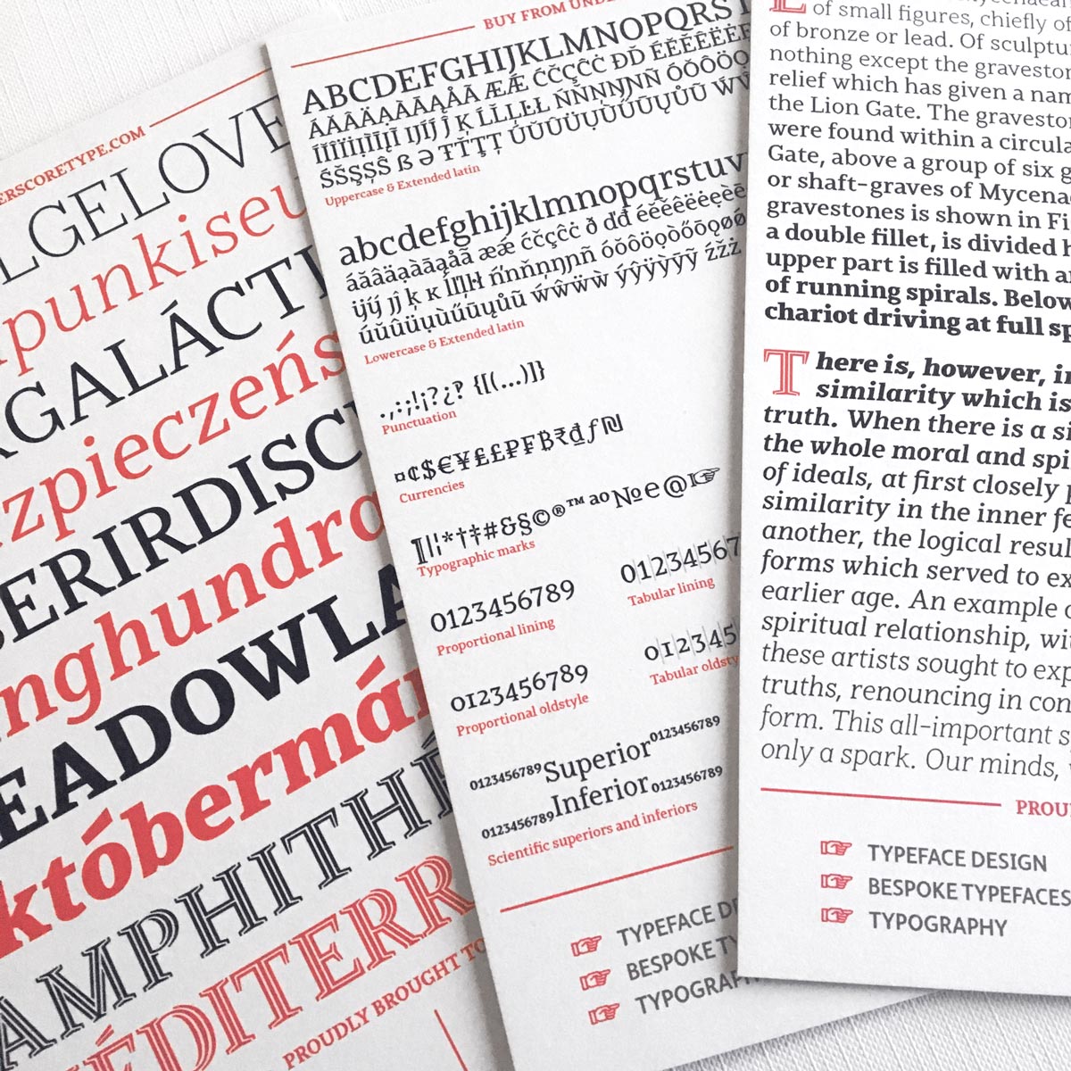
The versatility of this family comes not only from a wide range of weights, matching italics and support for over 200 latin based languages. The exuberant Capitals style expands the family to offer a unique typographic touch for headlines, posters, drop caps and other visual accents.
Origins and inspiration
Jozef has been in development for over two years, and is the proud first release under the Underscore label. In the initial stages of design the concept was focusing on the hard edges in terminals and serifs. Exploring this stylistic trait coincided with a growing desire to design a modern, but opinionated, serif text face.
In recent years a trend in serif typefaces is calligraphic inspiration, retracing the strokes and nudges of the pen. Jozef goes another way. With strictly symmetrical round shapes and vertical contrast the typeface is rooted in a more mechanical and rational mood. Although clearly far from the final design, one of the original inspirations was the Scotch types of the 19th century. While those have vastly different serifs and terminals and a decidedly more baroque feel to them, it was the same unpretentious vertical stress and pragmatic approach that inspired this typeface. As inspirations go, Jozef's own distinct character soon merged as positively more modern and coarse.
Throughout the design phase one prominent consideration was how a serif text typeface performs in current reading environments. In this regards the pronounced serifs help legibility on screens by forming clear serifs that are prominent enough to not smudge and blur beyond perception. Type designers often imagine potential use cases for their typefaces to guide the design and specify what is both technically and aesthetically appropriate. For Jozef this mental image of future use of the typeface was rooted in an age of ever more prominent online editorials and publications. Striving to be serious, informative but not without character or charm is often such a publication's typographic voice, and now embodied in the Jozef's visual DNA.
International and full of typographic range
It is hard to imagine a serious text typeface for a connected world and not stress language support. While Jozef, in its current release, anyway, extends only to the latin script, it does so with a very wide language support for over 200 languages. This naturally includes the major latin-based languages like English, French, Spanish, German and Portuguese, but also includes the required typographic range and special characters for less prominent languages like Icelandic, Sami or, why not, Esperanto (See all included glyphs here).
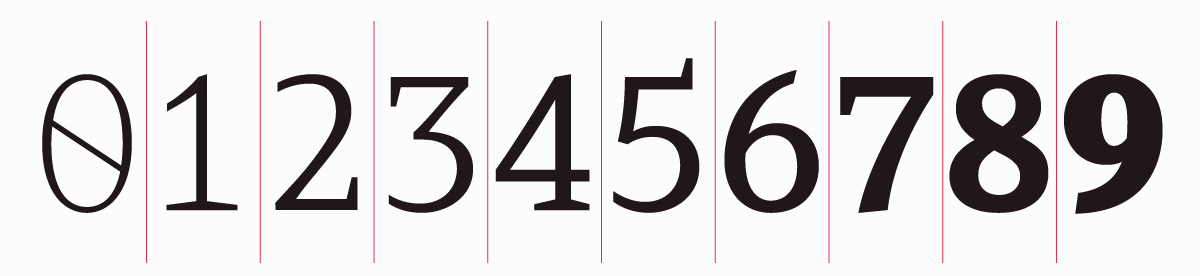
This all is supplemented by the sort of typographic finesse that lets typographers, designers and publications shine. Be it four different number sets (old-style, lining, and their tabular counter parts, as well as distinct alternate zeros), ligatures or auxiliary characters like currencies, extensive punctuation and mathematical signs. They all support users by providing ample options and a design that is carried out all the way.
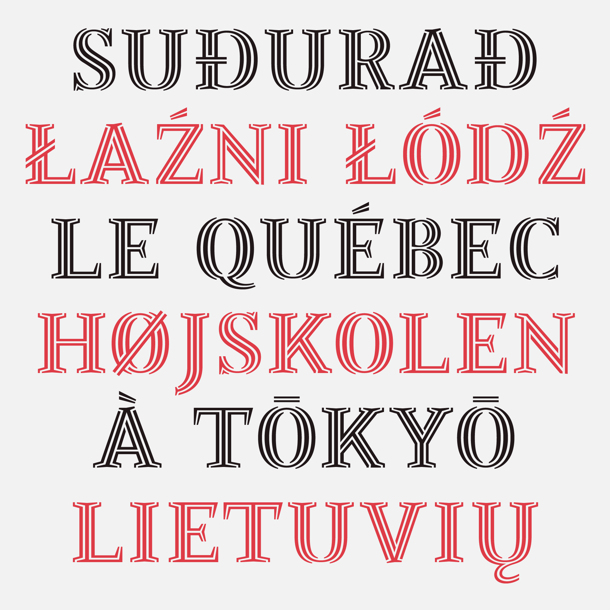
But quality typography often also means hierarchy. Many times this is font sizes and colors, but more often than not, having a wide range of weights to choose from helps. Jozef has roman and italics in no less than eight weights, so when aiming to differentiate text, highlights and headings, there is plenty ways to create a unique structure for any design. In addition to that, Jozef comes with a set of carefully crafted capitals. Flashy styles like that can not only be used in editorial design to set sparkly accents, but extend the usefulness of this typeface family to display applications like posters or other large scale visual elements, where the detail and decorative aspect of the capitals come to shine.
Jozef was released in January 2018 and is now available from the Underscore webshop with simple licences that cover both desktop, web and other use cases.