It is a fairly easy observation to make: Digital interfaces are predominantly set in sans serif typefaces. Operating systems, mobile apps, way finding screens, they all feature fonts without serifs. Some reasons for this are more obvious than others. Looking at the relationship between digital interfaces and their typography can also offer a deeper insight into how we interact with technology.
Rendering fidelity: Heritage from the low-res past
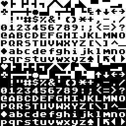
For the longest part of computing history the typography of visual user interfaces has been dictacted by low screen resolutions and their limitations. Bitmap fonts commonly had too little resolution to even consider serifs, and even carefully hinted vector fonts that started to appear in the 1990ies have long required a diligent typesetting hand. Especially in the smaller sizes they still ran the danger of becoming indiscernible blurry blobs. Since interfaces often have the implied additional constraint of condensing a lot of information into the available screen real-estate, the combination of serif fonts and small sizes has for a long time equalled sub-par legibility. In the current day of high DPI mobile screens and ultra HD televisions this seems less of a problem, technically speaking. Rendering fidelity, display resolution and anti-aliasing remain issues that still govern interface typesetting, and I am willing to bet they will continue to be for years to come. Despite considerable improvements in this area, there are more reasons why sans serifs still prevail in interface typography. Simply put, 40 or so years of using almost exclusively sans serif typefaces has left an impression on users and designers of interfaces alike. Serif typeface choices suitable for interface typesetting might now be available, and technically viable, but it is hard to change the visual language that is woven into the fabric of our digital culture. Arguably, we have become accustomed to the look of interfaces set in sans serifs, to the degree where the de-facto visual expression of interface typography knows little alternatives. Granted, there is the occasional website or app that utilises serif typefaces in their interface, but when done so it is always in an conscious effort to deviate from the prescribed formula and aim for a contrasting tone.
Computer aesthetics
"Bookish", "antiquated", "old", "sophisticated" - those might be terms that come to mind from classical serif typefaces, many of which have heritage dating back hundreds of years. These attributes equally underline what computers *are not*. It is not just for the technical reasons listed above that sans serifs have come to define the typographic voice of the digital medium at large. It is also history perpetuating itself. From one command line interface to the next, and on to graphical user interfaces, sans serifs offered a continuity that made users feel at home. Deviating from the established typographic standard would make any computer system stand out from its predecessors. With users oftentimes anxious about updating to newer systems and software versions to begin with, just imagine the disgruntled outcry a drastic switch in interface typesetting might cause. And it is not just the expectation of continuity. When designing for the computer environment, and interfaces in particular, the typography is required to look tidy and clean. Computers are, by definition, precise machines, and so it is no coincidence that the typography that translate between machine and user reflects this trait. Computers are not lyrical, playful, loud or "well-read", which all are attributes typography could equally express. The reason why it is not called upon to do so, is not a typographic one.
Modernism and neutrality
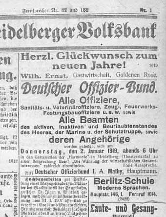
Knowing that we ascribe certain qualities to computers does not entirely illuminate this issue by itself. To an equal degree the history of sans serif typefaces helps to comprehend this seemingly inseparable bond. To begin with we have to acknowledgment that one sans serif is not like the next. In terms of interface typography, the predominant genres of sans serifs that can be found in interface use today are modern grotesks, the likes of Helvetica or Arial, humanist influenced typefaces like Lucida or Verdana, and more recently, and to a lesser extent, geometric typefaces like Futura. However, all these have seen their inception in common chapter of typographic history. The early 20th century is when each of these types has seen the birth of their first prototypical forms. They all were an antidote to the typographic choices of their age: The "finer" book-printing antiquas, various newspaper types, blunt egyptiennes with slab serifs, art nouveau titling faces, and let us not forget blackletter. Originally conceived of as a contrasting voice to make advertisements stand out from the aforementioned typographic crowd, sans serifs of various genres soon found praise and widespread application for their simplistic forms, somber tone and unadorned shapes devoid of mannerisms and visual clutter. Each of these styles has naturally gone through much transformation and re-interpretation since those early days. In the spectrum of typographic range, however, those early sans serifs' motivation to be a rational and modern counter weight remains as intact as ever.
Interface typography is what users expect it to be
The notion of rationality then brings us back to computers, and their visual interfaces. It is not just for technical and historical reasons that sans serif typefaces seem such a natural fit for interface typography. Typesetting (any) information is, in the widest sense, informed by two things: How it will be read; and what the content is. For interfaces, the former is influenced by those intricate details of resolution and what makes letters render on a screen and convey information, first and foremost, by being easily legible. In this compartment, sans serifs are no longer surpassing their seriffed alternatives as in early computing days. The later, however, is affected by users' expectations of computers. In this particular case the information is tinted by our expectations of computers, and technology as a bigger whole. The tone for this information matches what we expect of machines - and as such, the typographic voice that reflects this is coined by a rationalist ideology and positivist approach to technology. And consequently, it is set in sans serif.