From idea to typeface: How are fonts designed?
Typeface designers regularly face questions about how fonts are created, and rightly so I would think. It is fairly understandable for this obscure profession to appear somewhat mystifying to the vast majority of people — most folks have probably never even pondered the existence of a font or where it might come from. And truth be told, even for many professionals in the fields of design or publishing the process of shaping and producing a novel font is a small enigma.
What’s your process like?
Fonts are created on the computer, right?
How do you come up with ideas for a new font?
In this short article I share my personal perspective as type designer and describe some general as well as some idiosyncratic approaches to designing fonts. The fact is, like with most design work, the ways to shape a typeface are as varied as there are typefaces. Some processes and steps follow a natural logic, while others might be entirely dependent on the project or design team and how they work together. The following tries to answer this recurring question on a conceptual level and in terms of design process and approach. So let’s steer clear of the more mundane technical production aspects and start where it all begins: Ideas.
In the beginning there was an idea
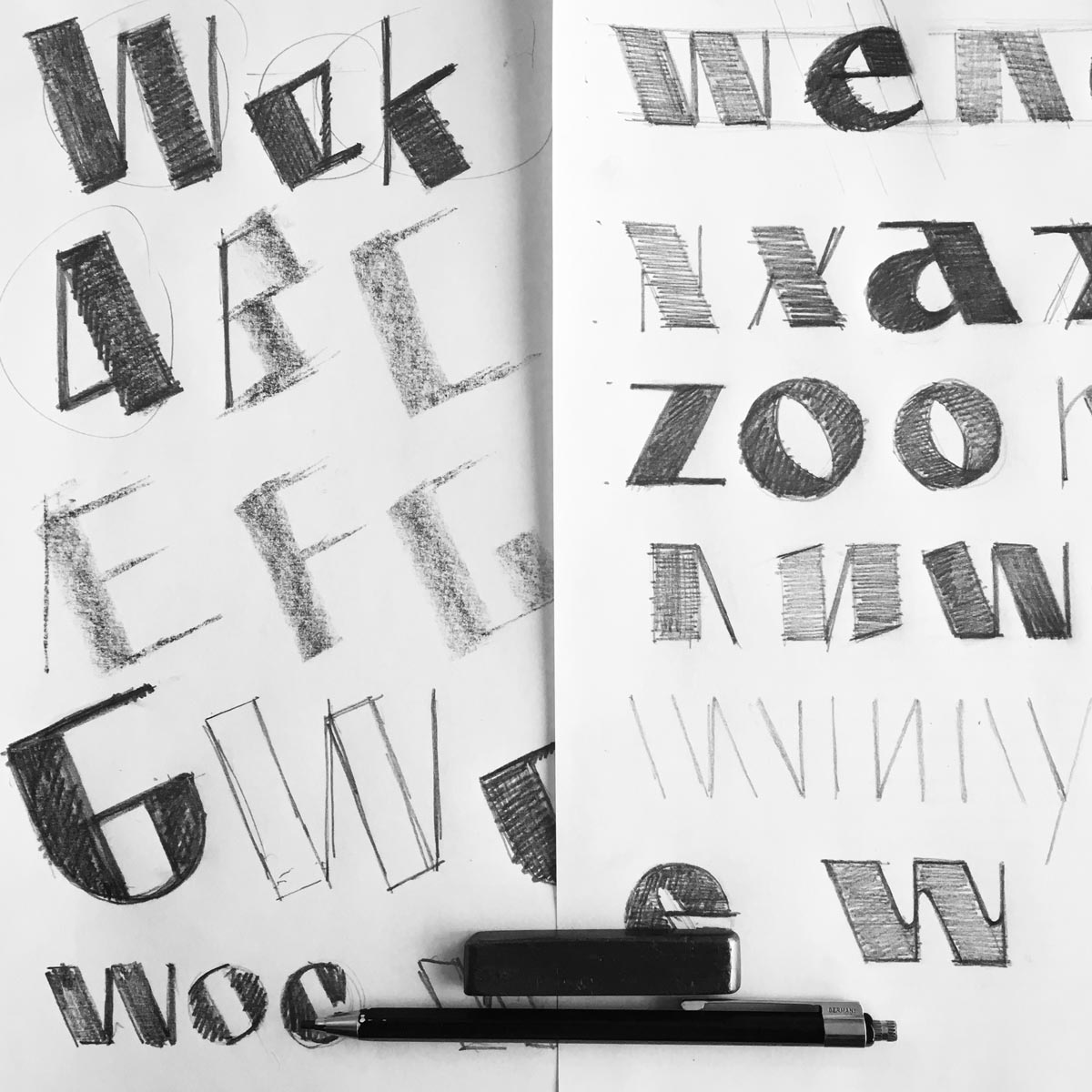
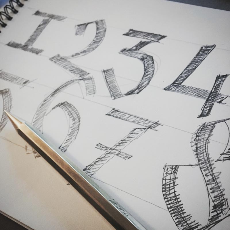
Nothing starts from nothing and type design, too, springs from ideas. How to generate ideas is an entire science in itself, but my personal approach lives from sketching on paper. The fidelity of sketches can vary from drawing the skeleton shapes of individual letters all the way to carefully mocking up entire words on paper, over and over. Before working on something you could even call a font, sketches are the basis from which those ideas grow. Clearly, a commissioned typeface and one created for retail purposes vary in some respects, especially how defined the brief for this new typeface is. But even with the more or less clear starting point that often comes with bespoke or custom projects, much of this remains the same.
When drawing new letters, there is a whole array of things that can inspire how the shapes will be formed. Many designs start with historical references and the visual sensations they offer, be it truthful revivals or simply reviving an interesting approach. Others spring from use cases for where and at what size a font could be applied to. Often these simple constraints can be enough of a friction point to innovate and experiment. And somewhere between the aforementioned approaches lies general experimentation with forms and shapes. A specific mood or overall expression can be a viable starting points, just as the more concrete challenge of how a certain interesting shape might be made to work in the context of other letters. Simple experimentation by sketching small sample letters that have one particular feature can be used to try and gauge their viability when the same shapes are applied to other glyphs. Often by accident these explorations lead to interesting discoveries, from which an idea then develops, bit by bit.
For my personal process the general habit of drawing often, ideally twice a day, is essential. These do not have to be long sessions, but the idea is to do it often and with a fresh mind that is open to new approaches. It is through these sessions that recurring patterns of interest form. From one day to the next a similar visual idea can be approached anew when it offers something of interest to explore. This might be deliberate, returning to yesterday’s sketches, or by accident, when a collection of shapes is subconsciously at the tip of your fingers.
Pen & paper
Clearly, not every type designer’s process is the same, and I have come to notice that I prefer to work “analog” for quite some time before turning to the computer. There is a few reasons for this. Least of all, it is sitting long hours in front of a computer, day in, day out. In contrast to that, working with pencil or brush on paper, the sheer joy of making marks that instantaneously manifest into shapes is something to cherish. It is at the same time spontaneous as it is calculated, and thus offers the chance for innovation. Meaning to draw a glyph a certain way and actually drawing it like envisioned are two different things. When ink (or graphite) meets paper, hand and eye have as much a say in what is happening as the idea on the designers mind. This can fail — which is okay, or might even yield interesting results. But more often than not working with the actual physicality of a shape is stimulating new ideas simply by taking shape.
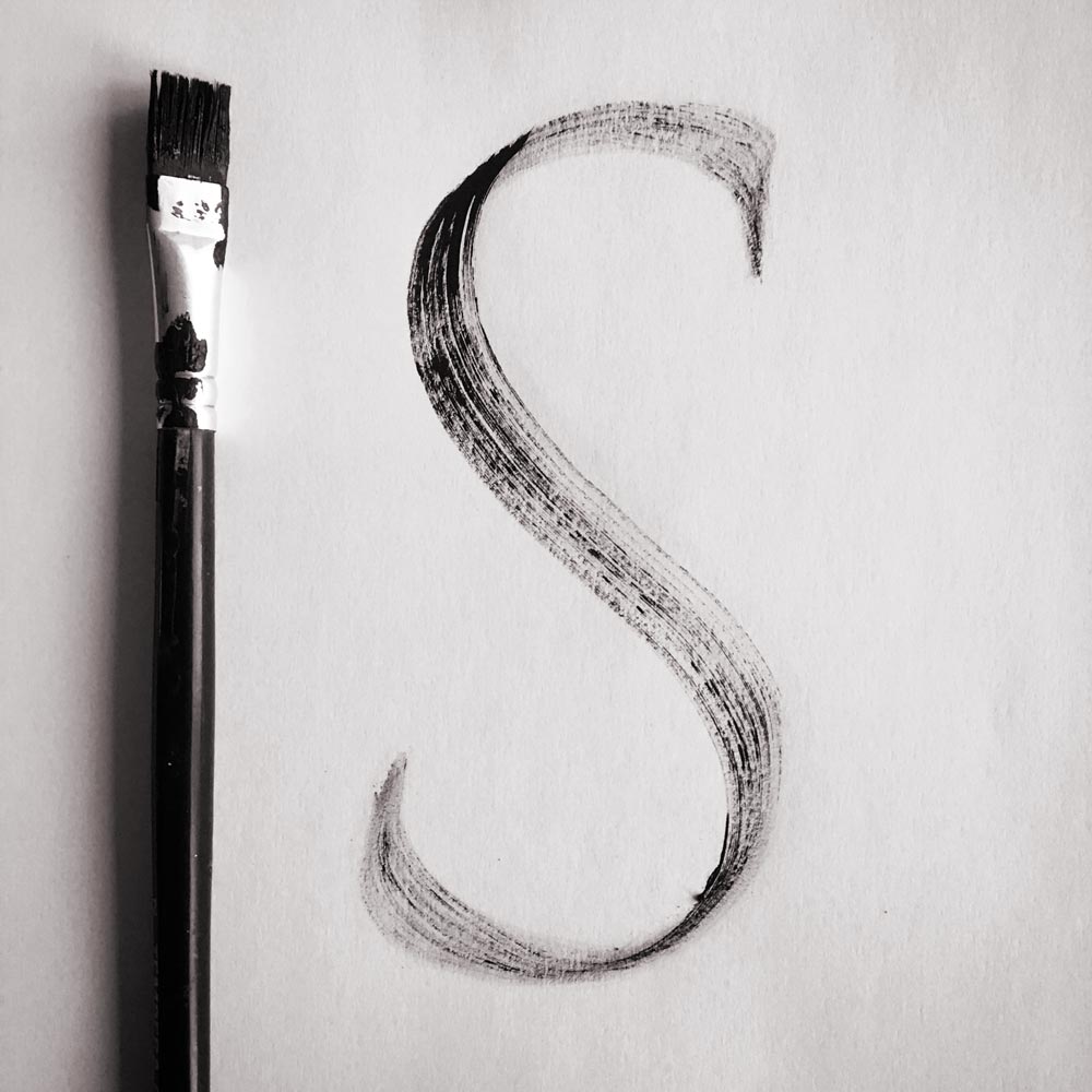
Working with actual writing tools has another reasoning behind it, though, and this one is of a more logical nature. Ever since movable type was invented some 500 years ago it has mimicked the written word — in fact, the first typefaces’ quality was judged by how well they imitated scribal handwriting. This might feel far removed from the plenitude of styles seen in digital fonts today. Constructed sans serifs, angular or otherwise unnatural display types, or even old-style Antiquas do not possess a handwritten feel to them at first glance. Throughout the development of type, however, fonts echo how we write and the materials we write with. Sometimes this imitation is done by actually trying to look handwritten and irregular, other times the connection to the written heritage is ingrained in the font through the conventions of how letters are constructed and written out. Characteristics like the think or thin or steep or straight of lines often spring from how those shapes would look if written by hand with a particular writing instrument. Working with actual physical tools helps maintain, rediscover and question this connection to handwriting that is so inherently embedded in every typeface.
Lastly though, and as a professional designer working within the constraints of a limited amount of work hours per day, drawing (or writing) by hand is simply put fastest. This is a highly personal opinion, since many folks argue for use of computer early on in the design to quickly begin working in the eventual medium of production (whoops, spoiler). However, iterating the essential shapes of a design repeatedly on paper helps materialize a the clear vision that makes consequent digital work determined rather than inquisitive. Or in other words: If I know how I will draw a letter, I can easily draw it again in the digital domain. It helps to comprehend what is the logic of how a certain shape is constructed and how it will look. This in turn is essential for actual typeface design — the designing of a coherent whole where every glyph should have similarity in heritage to all the others.
Rodeo with bezier curves
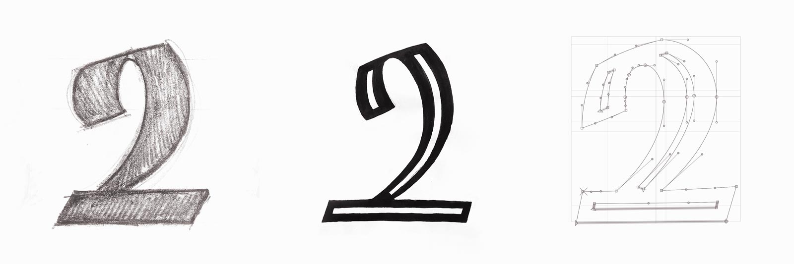
If, like myself, a designer is not prone to start a new font right away in a font editing program, there inevitably comes the step from analog to digital. For designs that encapsulate the very mannerisms of writing, like calligraphic or brush scripts, digitizing actual sketches seems a pragmatic approach. For most other type design, the eventual shapes in the editor will be very much removed and more clean than any drawing, so the analog work serves as a reference. There is both benefits and detriments in having actual artwork as a blueprint when drawing the vector curves and points into a letter shape. Without it, sometimes the right tension of curves or other proportions get distorted when re-drawing on an empty digital canvas. However, using a sketch as basis might equally be misleading — sticking too closely to the drawing might result in mis-shapen results between several drawings and letters, and eventually there will be glyphs that have not been sketched at all.
After extensive sketching and digitizing some letters the following is easily one of the most exciting and vivacious times in the design process of a typeface. With a few digital characters in place the real shape finding can set about. With the very basic letters of our alphabet (and, in fact, other script’s alphabets just as like) the essential task is to make something new, while keeping the shapes close enough to established shapes and convention to be readable. Type design is not, or rarely, a matter of coming up with fancy new ways of how to construct a letter. Such efforts are often gimmicky and they stand out like a sore thumb, and a pretty useless one at that. Type design really is about how to infuse the various combinations of letters with a unique aesthetic while also sticking to the basic forms of those glyphs that readers recognize. Thinking of type design as crafting the voice of a text is a pretty accurate metaphor.
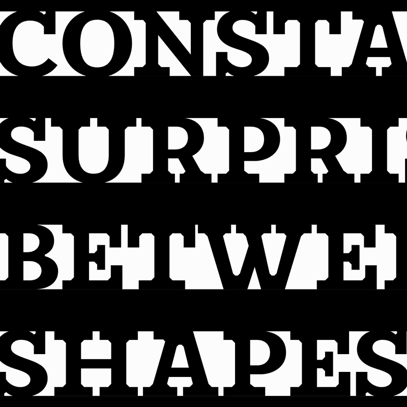
At this stage, the design evolves only slowly in number of actual glyphs. Unlike you might imagine, starting to draw out the entire alphabet is not very useful at the beginning of this process. In fact, letters that feature shapes that form parts of other letters, like H, O, V, n, o and v, are the ones to focus on. Since typefaces are somewhat modular systems in which one letter is related to the another, defining the most atomic of letters with the most essential shapes is equally defining the overall appearance of the font. How tense are curves, how much does the thickness of strokes vary, how dark are the letters against the light of the page, and how tightly do they sit together in all four directions? While it is easy to just cut and paste an o and n into d and b and q and p, there is little value in doing this early on. Shapes will change, and the insight gained from multiplying the same shapes to more letters is little. Conversely, trying to figure out other more unique letters (within the shapes of all letters of the alphabet) like a or s or g helps further find what makes a font tick and differentiates it from the thousands of fonts already in existence.
A font is more than the sum of its letters
When a fair amount of letters have been shaped in their essential forms, fitting them together to words is where the actual work of designing a typeface takes place. How the various shapes of different glyphs affect each other and the space around and in-between them is where a well designed font is more than simply the sum of its letters. Often what looked good by itself does not work well when used in the context of other words. Some glyphs might look too busy, others too bland. Finding the right harmony of shapes is something that also draws on a lot of passive background knowledge of visual culture. Drawing a letter s its terminals might take any number of shapes. However, it is not just a matter of how those pure shapes look like by themselves, but what we as readers have come to associate as visually belong together and forming a harmonious and uniform font. A type designer has a lot of referential knowledge to draw on in this regard. Such subliminal judgment of how well shapes harmonize is the outcome of looking at letters — a lot. And the focus is on looking, not reading, because this is a crucial difference. Browsing through old foundry specimens, insatiably studying every detail of letters from books old and new alike, and drawing such letters is what makes type designers see letters in a different, more analytical way. It is the details which regular readers do not even realize are there that get shaped at this stage.
Yet keep in mind, that a font is really just one particular style of a typeface. And in the days of physical type, this used to even refer to only just one particular size. Be that as it may, fonts, now and then, rarely come by themselves. There is more beyond the stylistic coherency among the glyphs of one font. Next come considerations of how a typeface works as a family of fonts. Related in shape or style, the concept of a font family is relatively loose and permissive of experimentation. What matters from a design standpoint, however, is how members of this family of shapes interact. While it is equally fine to simply design a single font, or even one style after another, often a more natural process is to consider and shape the relation of different styles. Is an italic or oblique a matching partner for this font? How should different weights of one family relate to each other when used together?
Creation of different font styles often happens via interpolation. This means a designer might shape the most extreme styles, like thin and heavy, and the computer generates weights in-between by averaging those shapes. This simplification makes this sound fairly easy, but designing in a way that the progression of interpolations remains an even for the entirety of the charset of a font can be a challenge. Especially since quality (Latin script) fonts often well over 500 glyphs each. Fairly often, though, designing a family also is conceptual work. Simply adding styles for the sake of it is rather ignorant. In contrast, deciding what kinds of styles to design and offer to typographers and designers actually expresses what a typeface was designed for. Take a display typeface for headlines, as example. When the fonts are designed to be used for a few words at a time, does it make sense to design an italic — a style used for highlighting?
Testing, and then more testing
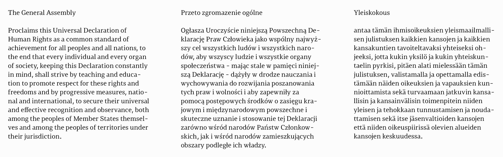
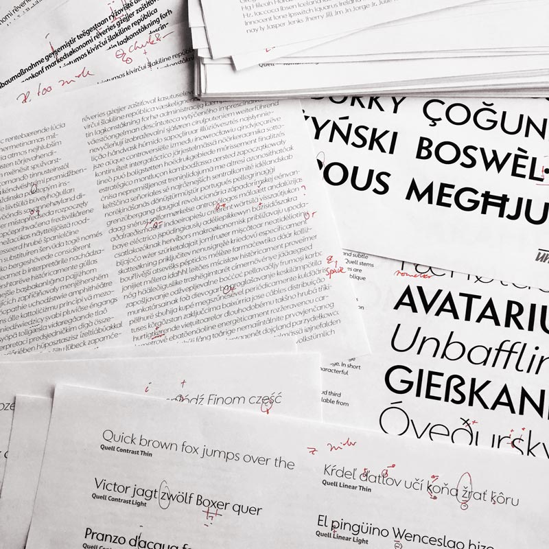
At the same time this stage requires testing, a lot of testing. Over and over viewing glyphs in different words, in different paragraph settings, with different line heights, at different sizes. It all adds up to judging the aesthetic quality of a design. I have heard it said that a type designer is only as good as his or her testing documents. And I could not agree more. This means various types of text. Some general in nature, others designed to specifically test, for example, numbers or punctuation marks. And languages: It is an odd sensation to describe accurately, but the same typeface looks different when typesetting different languages.
At first testing helps primarily with design decisions, but it gradually turns into a quality assurance measure. Especially the process of spacing a font and defining its spacing exceptions, so-called kerning, is something that can only be truly judged with real words and text. But testing is not only an after-thought, something to do when the font is “finished”. Testing is designing a typeface. By looking at the shapes of letters, words and text — and making choices based on that — you are designing a typeface. This process is highly iterative, and requires a tenacious nature. As mentioned before, typefaces are modular in nature. Fine tuning one parameter, say x-height, might actually affect the line spacing a font requires. Changing one thing means going back and rechecking others, again and again.
Even after countless hours of tweaking and modifying the shapes it comes down to a well-known industry truism, namely that are typefaces are never really finished. Depending on the extent and care a typeface requires, this process can stretch anywhere from weeks to months or even years for more involved multi-script projects. At the end of this process, however, comes a point of having to let go and sending a font out into the world. In this, too, the digital age is drastically affecting how type is designed and released. While type once cut and cast in lead were for the most part a done affair, fonts quite regularly receive updates nowadays. Typefaces have their charsets expanded with new glyph or script additions, or new styles get added to develop the usefulness of a family. At the same time even digital fonts are no longer just installed once, but subscription services and cloud delivery make it comparably easy to issue updates on the fly. Considering how some typeface classics from even the easiest days of type design history are perpetually reinterpreted and revived, one statement remains more true than ever:
Typefaces are never really finished.
To the users of type I hope this little process description could convey at least a glimpse into the work that goes into shaping letters into fonts. If there is other aspects of typeface design that interest you, feel free to leave a comment here or on twitter @underscoretype. Naturally, I am also curious to hear other typeface designer’s workflows, let’s talk!