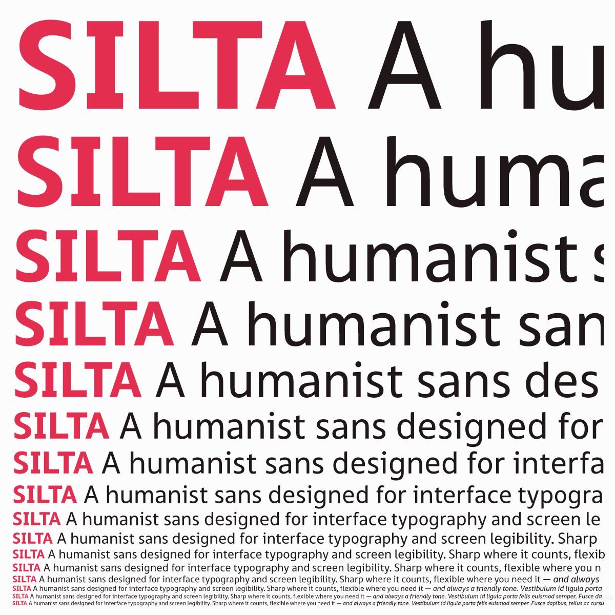
Introducing the Silta typeface — A family of fonts for legible interfaces and beyond
This versatile humanist sans serif is a modern typeface designed for a connected and global world of screen interfaces, online reading and signage. Unmistakable letter shapes, open apertures, and a typographic repertoire to cover over 200 latin based languages make this typeface family a resourceful workhorse. Owing to its Finnish name (translates as “bridge”) it is a powerful communication tool allowing designers to reaching across to users and readers with clear and distinct typography.
While the origin of this family of fonts springs from finding and fine-tuning a sans serif to the very specific use in interfaces, the result is a solid choice for many typographic purposes. In tone Silta is friendly and open, understated but with its very own soft character. This makes it applicable to a wide range of topics and tasks. Its true italics contrast the roman styles with a decidedly more casual and sympathetic voice. An ideal companion for highlighting, emphasis, quotes or contrast. Like other text fonts in Underscore’s repertoire the vast majority of latin-based languages is supported by default, providing coverage for over 200 languages in total, and including many typographic tools like Opentype features, ligatures, number sets and symbols.
Designed for interface typography means first and foremost excellent legibility, all the way down to small sizes. While specific attributes provide crisp rendering on screen, the open and distinct shapes result in great legibility also on paper and in way-finding application.
A typeface with research background
Silta stems from research of the design considerations for typefaces used in interface typesetting. This master thesis in design (form Aalto University School of Arts, Design and Architecture) forms the framework for the design of this typeface family that is ideally geared towards interface typography. Analyzing the history and aesthetics of typefaces used in interfaces, the technical aspects of screen rendering, as well as applying research from cognitive psychology, Silta is the outcome of combining best trade practices with research finding in legibility and readability.
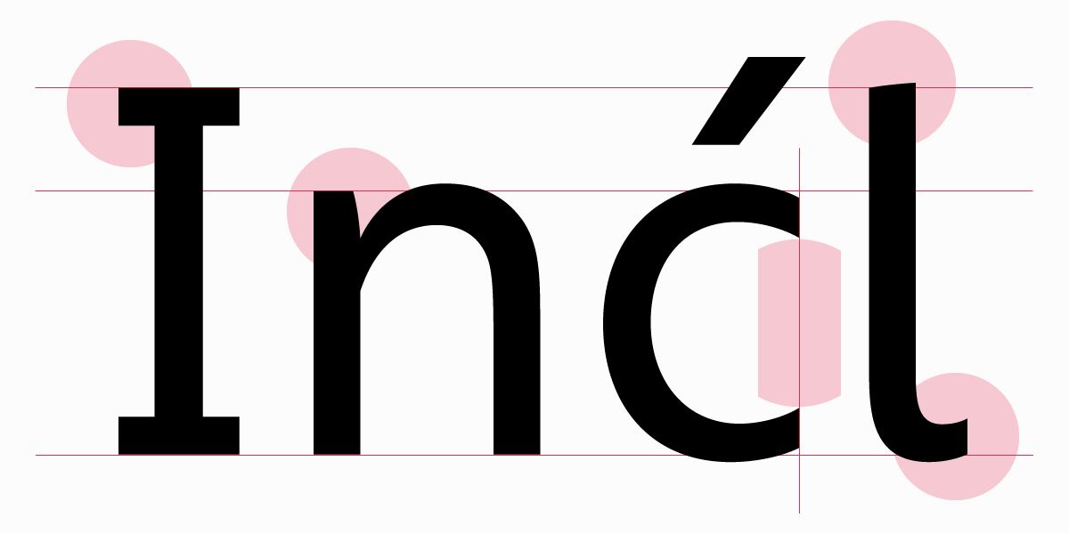
One of the cornerstones of the design is the premise that no characters should be mistakable for one other — is this letter a “1” or an “l” or an “I”? Interfaces in particular need to communicate meaning without leaving any doubt for several reasons. Firstly interfaces might contain elements that contain words or acronyms users have never encountered. Secondly, interfaces already put strain on the cognitive load of users, thus using a typeface that reduces any potential for confusion and is immediately legible at a glance improves overall usability. And thirdly, interfaces are responsive. They adapt to the user and their reading situation, and as such the typography in them needs to be as resilient to fault as possible. Deciphering a mobile app menu against sun glare is hard enough — offering the user with the most legible font possible means it will retain those characteristics even in unexpected or unsatisfactory circumstances.
The devil (of legibility) is in the detail
In a project that sets out to design a highly legible font there is a clear caveat that needs to be addressed. Almost all fonts are legible. In fact, the most fundamental task of any font is to be legible. When one font is claimed to be more legible than another, it is in minute details of the shapes and spacing that such efforts are undertaken. For many applications, like headlines, posters, moderate or large physical font size, the differences are negligible, if not even counter productive. Being designed for interface typography, Silta has a very specific use in mind, and was designed to perform at that size, rendering environment and usage situation. Interfaces need to communicate quickly and not stand in the way between user and the content they want to access. Drawing attention to itself and the shapes of the font can harm the efficiency and well designed user experience of any app, website or sign-posting.
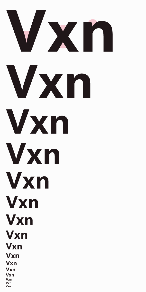
Silta shows its intention for text sizes in a careful balance of the font’s color — that means the overall even appearance of a block of text, where no spots are significantly darker or lighter. This even color in turn means the font does not distract from the text it renders. When letters with joins, especially diagonal joins like in “V” or “M”, get scaled down to small sizes, the join where strokes meet often blots and becomes darker than intended. While so-called ink traps are a common staple in designing print typefaces, the same principle is applied in Silta to counter the darkening effect that smoothened rendering on a screen can have on fonts. Corners where lines join are hollowed out in Silta, which compensates for these blurred dark spots and keeps the fonts’ appearance even and distraction free.
Another feature that underlines Silta’s intention for interfaces is the attention to making all letters of the typeface absolutely unmistakable. In regular reading situations readers use word and sentence context to essentially read quicker and compensate for illegible or even missing characters. In interfaces the case can be a different, when such context is missing. Does a menu entry mean “01l” (Zero—one—el) or is it “Oil” (Oh—i—el)? When reading an entire sentence it might be immediately clear, but pressing a button to check, let's say, the Oil in your in-car interface it would be nice to be absolutely certain what the button does beforehand. "Il1" is just one such triplet of easily confusable letters, but many more combinations like “rnm”, the “tl” pair, or numbers and letters like “0O” are just a few that research has proven to be easily confused.
This focus on interface typography further shows in spacing. Any designer is familiar with the dilemma of having to condense a lot of information into the user interface. Silta’s lowercase has generous x-height, which means that the letter parts between the baseline and the height of the lowercase letters, namely like “x”, have a lot of space. And for legibility, space is good, because it prevents features of similar looking letters like “eco” blurring up and becoming confusable. At the same time, the ascenders and descenders of Silta are kept very short, so letters like “d” and “p” do not require that the block or line of text has much excess space above and below, which would be wasted in interfaces already struggling to fit much information on the screen.
A workhorse for modern applications
At the end of the day no one font dictates exactly how it has to be used. In fact, that would be terribly boring. Silta offers legibility designed for a very specific purpose. At the same time, this makes it a very resilient typeface design that can shine in many settings where legibility is important. No typeface has no character. Silta is a somewhat neutral face, but clearly has some friendly tones to it. Categorized as a humanist sans serif also means the vertical proportions of the letters among each other draw on heritage that stems from hand-writing — as opposed to the more machine-like and constructed proportions of other grotesk sans serif genres. Paired with the true italics this typeface family offers some softer tones in its repertoire that make it well-rounded and generally useful typeface to have in any designer’s toolkit.
Silta was released in January 2018 and is now available from the Underscore webshop with simple licences that cover both desktop, web and other use cases.